Andrew Ashton
Book Design
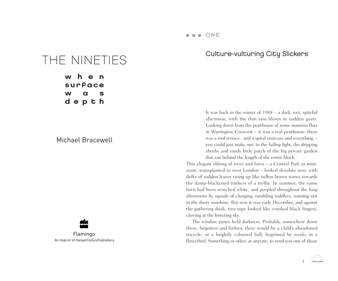
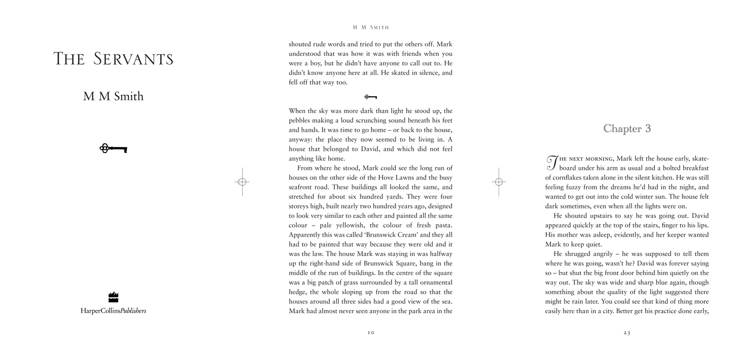
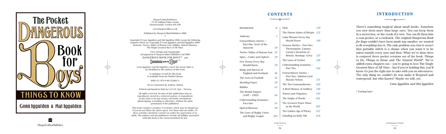
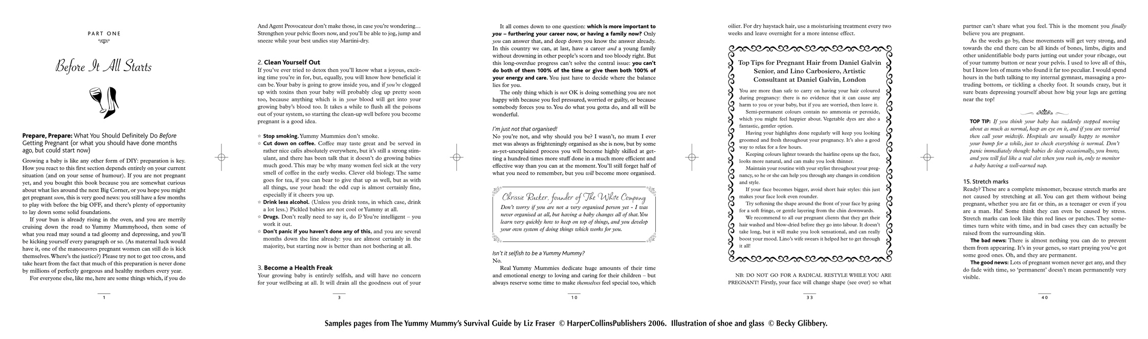
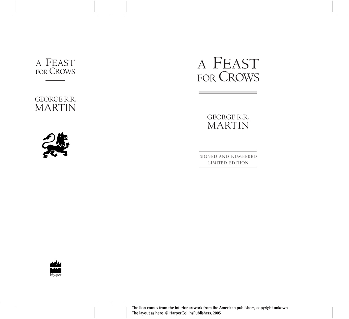
I’ve spent most of my working life as a book designer, winning a national award for the book design for the Dangerous Book for Boys. Everything you see about a book has been designed at one point or another. The cover, the spine, the title, the chapter heads, the main text, the presentation of photographs and artwork. A lot of book design is technical. It isn’t just about the look of the book, although that matters a great deal. The choice of font can affect the readability which in turn attracts different age groups, and it can also affect the overall impression you want to convey with the text whether it is academic, easy to read, modern, etc. It can also affect the length and size of the book. The extent of books are carefully controlled. Ideally a book isn’t too big because then cost of paper and printing becomes an issue and you don’t want a book to look too thin otherwise readers are put off thinking they aren’t getting value for money. So a book designer has to be able to calculate how long a book is going to be using a certain font. If it doesn’t work then the font or its size might be changed, the line spacing might be changed making it more spacious or more dense, the margins, the drop of the chapter heads, the page spacing, kerning or loosening lines might be used to remove/expand pages, sections can have pages inserted or removed, indexes and other endmatter can be stuck in columns to save space... Book design is also required to adapt books from different countries to new countries because of different paper sizes and formats. Also American books with a lot of shading and border illustration might have these removed for the UK market. In these cases I’ve reworked someone else’s design. There are also the new editions. Sometimes books are published in one list and then after a while republished in another but with a different setting.
Anyway here are a few samples which not only show off different styles but also features which you see all the time but you don’t give a second thought to such as running heads, footnotes and indexes.
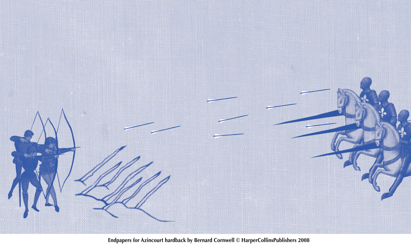
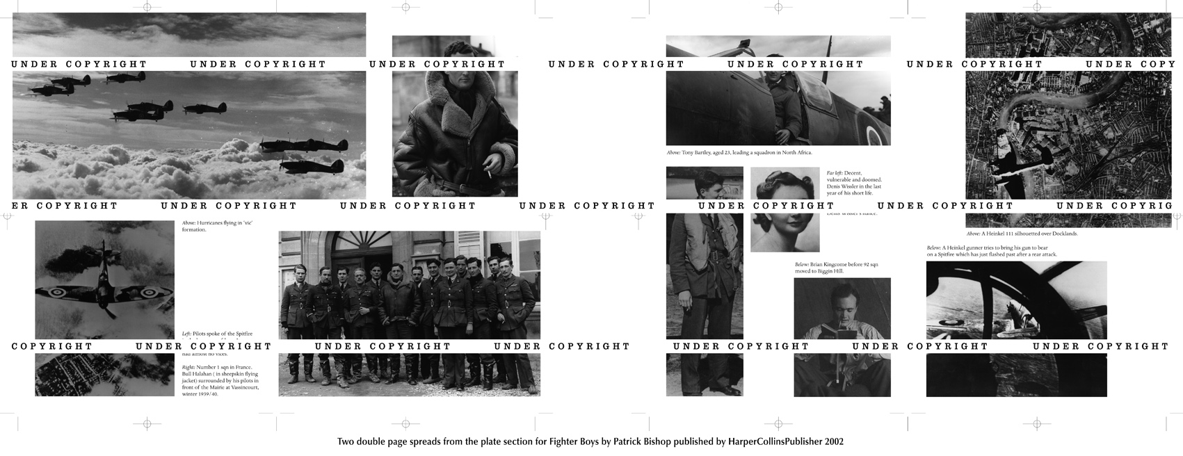
Endpapers, plate sections
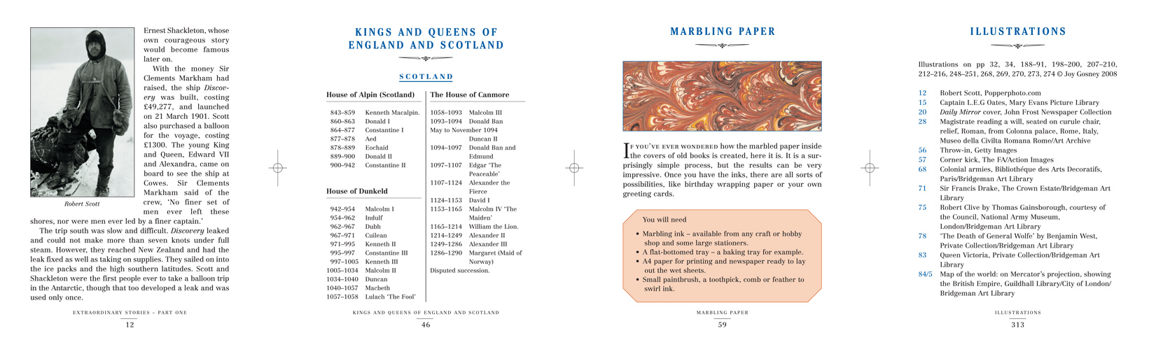
This section I’ve stuck in the other parts of the book you don’t necessarily think about, and also bits I haven’t covered elsewhere.
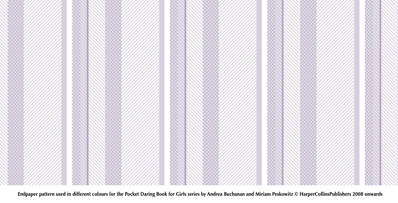
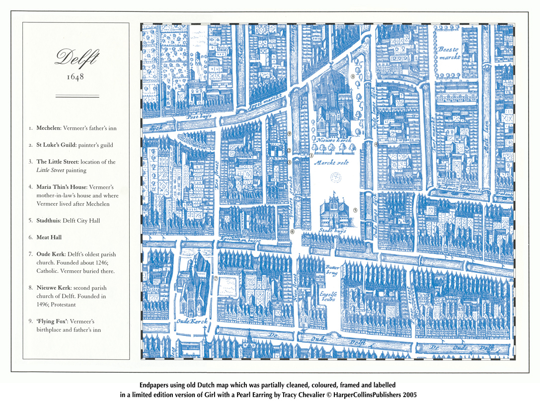
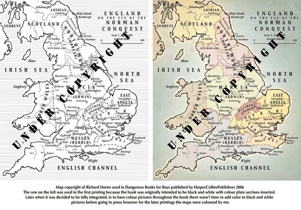
Here are endpapers, which are separate sheets of papers which are stuck to the inside binding of the book. Some of my maps were produced as endpapers. The endpapers here are simpler but show other things I do, for instance simple artworks, or patterns, or reworking/repackaging of old maps (which are out of copyright) which usually means cleaning them up and then adding colour or borders, etc. Included in this are internal modern maps done in the last few decades where the publisher has lost the original files and the map has degraded with printing and they want a fresh version for digital purposes. I might scan the map and then remove blemishes and blotches where possible and restore border lines, and any shading/tints which have been lost.
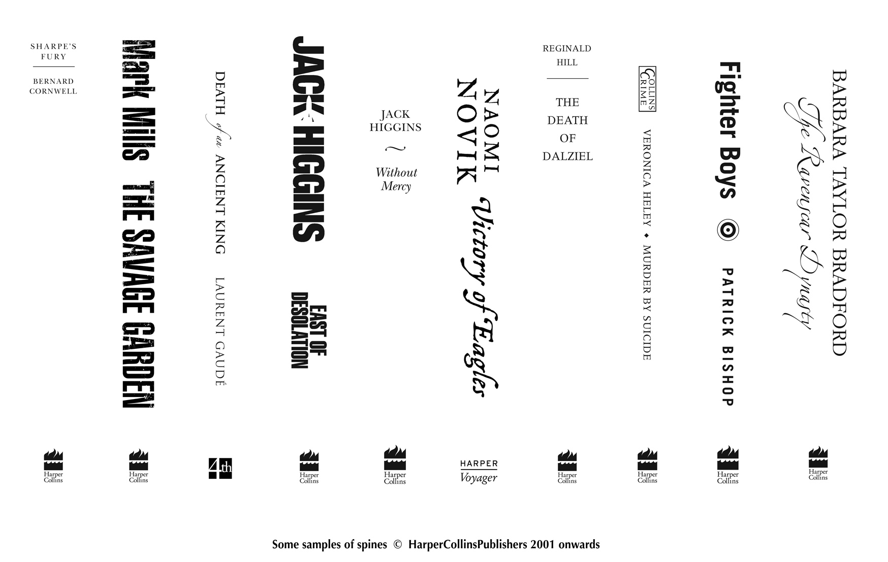
Spines
Also here is a spine, because I’ve worked on a lot of spines. Sometimes the spine will match others in a series, other times they will match the cover, and other times neither of those, and it will be either new or generic.
Home
<>
Introduction
<>
Maps
Acknowledgements
<>
Illustrations
Misc
<>
Fonts
<>
Photos
<>
Contact